How to Bring Autumn Essence into a Summer Wardrobe
I have a confession to make…
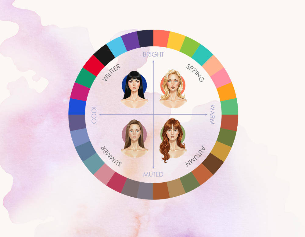
I want to be an Autumn.
Which is slightly ironic, considering how much time I have spent exploring what it means to be a Summer. I know my colours. I know that the cool, muted shades of Summer make sense on me. I know the difference between a soft grey and a warm beige, between a dusty rose and a bright pink. I have spent enough time analysing colours that I should probably be immune to the temptation.
And yet…
I still lust over Autumn colours. The deep golds, the warm olives, the maroons, the chocolate browns (oh, do I adore chocolate). The depth and richness of these shades ooze something so sensual, grounded, and effortlessly sophisticated. They represent the style archetype I want to achieve for myself.
This is where I think personal style becomes much more interesting than simply finding your colour season. Knowing your palette is an important piece of the puzzle, but it is only one piece. Style is also about personality, mood, lifestyle, and the feeling you want your clothes to create.
The Grounded Side of Me
So the inspiration for this post came from a rather expected place — Pinterest. While exploring different style aesthetics, I came across a very fun (and admittedly very unserious) styling idea — dressing according to your birth chart.
The premise is simple — different placements represent different sides of your personality. Dress as your Sun sign to express your core self. Dress as your Rising sign when you want to make an impression. Dress as your Venus sign for beauty and magnetism. Dress as your Mars sign when you want to feel confident and powerful.
And while I am not claiming the planets are going to choose my outfit for the day, I loved the idea behind it. Maybe we are not just one style. Maybe we have different versions of ourselves that we want to express. And maybe the reason I keep returning to Autumn is because it represents a part of my style essence. So naturally, I started looking at my own placements.
Enter chat: Taurus Mars.
Because when I started reading about the Taurus aesthetic, I found myself thinking Wait… this actually makes a lot of sense.
In this styling experiment, Mars represents the side of yourself you channel when you want to feel confident and powerful. Taurus is an Earth sign, and the aesthetic often associated with it is very grounded, natural, sensual, and connected to the physical world.
That sounds familiar…
Suddenly, my obsession with Autumn colours was making a little more sense. It is not that I want to dress like an Autumn because I want to abandon my Summer palette. I think I am simply drawn to the essence these colours represent — feminine, sensual, and a little bit untamed.
The Taurus influence also explains some of my love for tactile pieces — leather bags, boots, and anything that feels like it will age beautifully and become a part of my wardrobe for years.
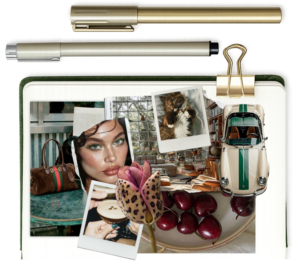
I suddenly realised my attraction to Autumn was never about becoming an Autumn.
I was trying to recreate a feeling.
And this is where I think Summers have a little secret.
A Summer can still wear depth. That is actually the thing many people misunderstand. Summer is not the deepest season in the traditional sense — we do not have Autumn’s earthy darkness or Winter’s dramatic contrast. But depth does not only come from darkness. Because Summer colours are softened with grey, they carry a quiet depth of their own.
The “Summer version” of Autumn is not the obvious lighter version. All seasons have light and dark colours in their palettes.
Autumn’s depth is warm and earthy.
Summer’s depth is cool and misty.
The warm olive that draws me to Autumn has a Summer cousin — sage green. The rich chocolate browns transition into ash browns. The earthy terracotta tones become softened berries. The undertone changes, but the grounded earthy feeling stays.
Autumn’s summer cousins
Warm olive → Sage green
Same earthiness, cooled down.
Chocolate brown → Grey-brown
Less cocoa, more ash.
Terracotta → Rose mauve
The soil births a rose.
Maroon → Cool plum
Still moody, just less ripe.
Mustard → Pale khaki
This one is niche!
The colours change, but the feeling stays.
Now, this is a style inspiration post. It would be pretty lazy of me to leave it at just swap brown for grey, wouldn’t it? Luckily, that was never the plan.
I think there is a temptation when you first discover your season, to look at every piece that does not fit your palette and ask yourself Should I get rid of this?. Some pieces stay because they have character. Some stay because they make you feel amazing. After all, personal style is much more than a strictly curated collection of harmonising colours.
Earthy Summer Manifesto.
Before we get into the outfits, I want to establish the philosophy behind this experiment. Because this is not about turning a Summer into an Autumn, or creating a list of Autumn colours you are allowed to borrow. The real question is how do we capture the qualities we love about Autumn — the fire, the sensuality, the earthiness — while still respecting what makes Summer unique?
So, here are my two manifesto points:
#1: Plant Your Roots
Find the earthy side of Summer. These are your roots — the foundation that allows everything else to grow.
#2: Evolution, Not Revolution
Your whole wardrobe does not need a reset. The goal is not to replace your Autumn pieces, but to learn how to style them through a Summer lens.
Case study #1
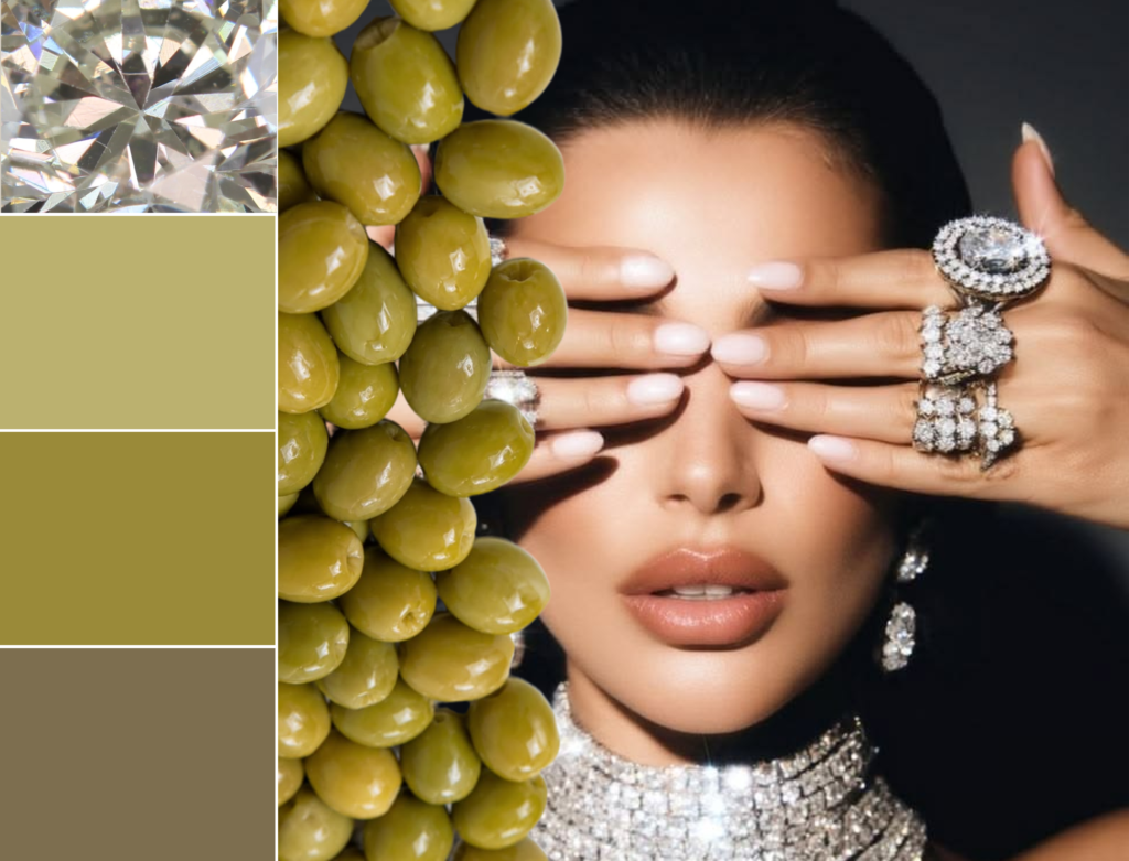
A combination that currently lives in my head rent-free is olive green and silver.
I spotted it on a TV show: a deep olive dress paired with a sparkly silver zirconia necklace. On paper, according to colour theory, this combination should not harmonise. But honestly? I did not care. I was mesmerised.
The look was looking.
But why did it work?
The silver is doing two things. First, it establishes a cool reference point — it is the element that anchors the outfit back in the Summer palette.
But the second part is more interesting: it is not just the colour, it is the finish.
A flat, matte grey next to olive could easily make the combination feel dull. A stark white would make the outfit feel obviously out of harmony.
However, the reflective surface of silver and the brilliance of the gems bounce light back onto the
olive, softening it and making it appear ever so lighter.
This look is still not harmonious. Nor it was never trying to be. It is a great example of controlled contrast.
The silver does not try to make the olive Summer.
It introduces a completely different element
— tension.
And that tension is exactly what makes the combination so interesting. The olive brings depth and earthiness, while the silver adds light, sparkle and a touch of drama. The result feels unexpected, but also incredibly intentional.
The olive is one continuous field of colour, and the silver acts as an accent. It frames the olive rather than competing with it.
Needless to say, I have a couple of olive dresses in my wardrobe that are waiting to receive the same treatment.
Case study #2
I was digitally combing through pages of Vogue looking for unusual colour combinations that could capture an Autumnal feeling while still working for a Summer palette.
A very niche way to spend a Friday night, but a girl’s gotta do what a girl’s gotta do!
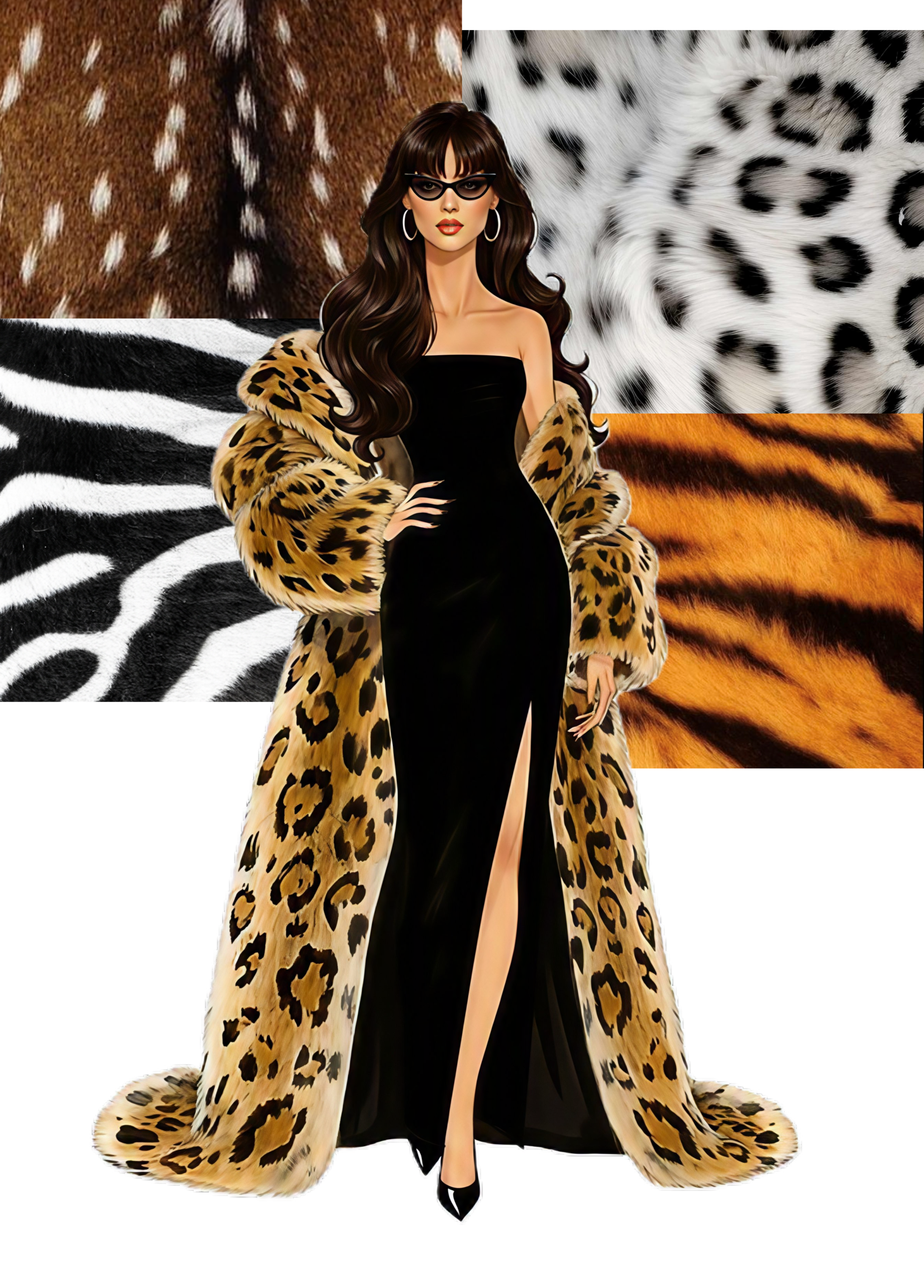
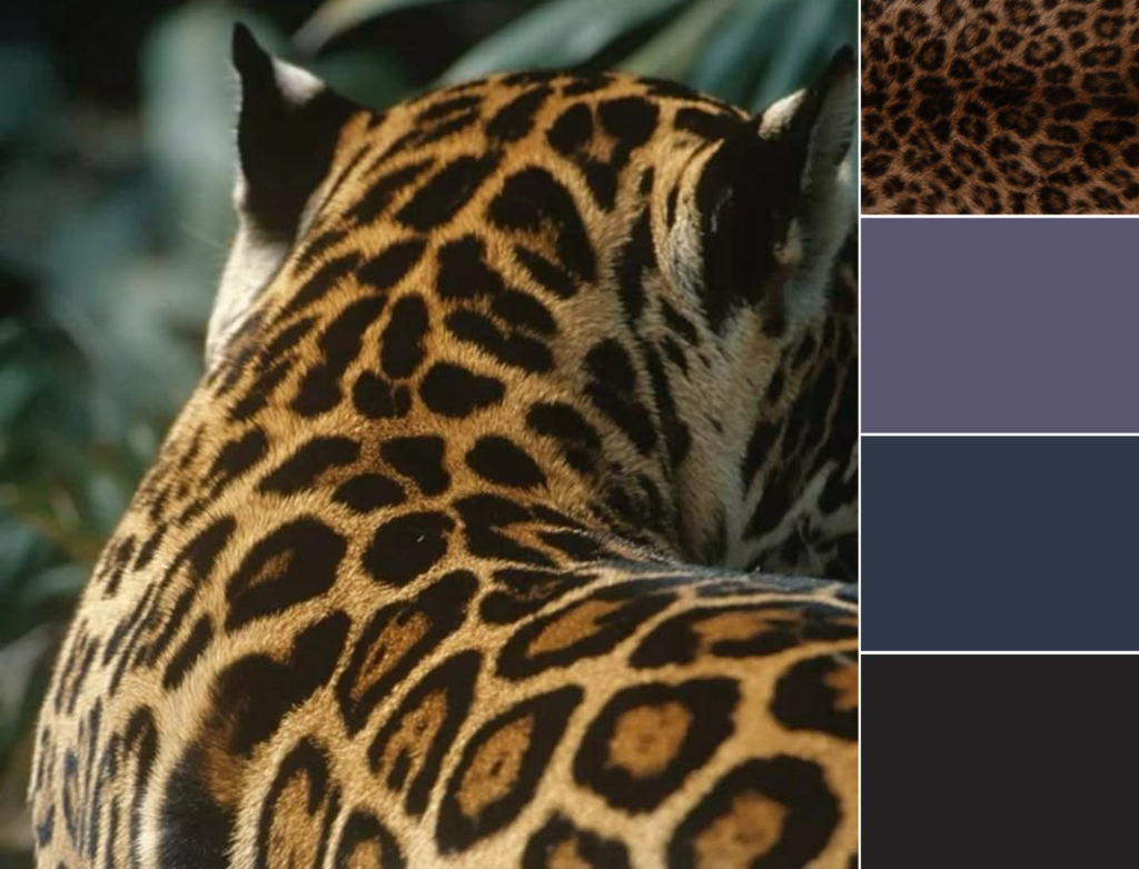
A combination from the Sally LaPointe FW2026 collection caught my attention: leopard and slate grey.
Yes! This is it!
This is exactly the kind of outfit that channels my Taurus Mars Autumn essence. I’m laughing too, but also… am I wrong?
And we are already starting to notice a pattern.
There is usually one element that connects the look back to the Summer palette, and one element that brings in that Autumn influence.
However, this example is a little different.
The contrast is there — the warmth of the leopard against the coolness of the grey — but it is much less dramatic than the olive and silver example.
What makes this pairing work?
Both elements sit at a similar level of depth.
A light grey, for example, would not have the same effect. It would compete with the leopard in both value and tone, creating a disconnect.
Many slate greys carry a subtle blue-violet undertone. It is the perfect deep Summer colour as it has depth without the harshness of black. The colour is able to stand alongside the print. It has enough depth to hold its own without overpowering or being overpowered by the pattern.
Together, they create a grounded, muted look that is not dominated by warmth — exactly the balance we were looking for.
Case study #3
My third source of inspiration wasn’t a runway this time.
It was a fig.
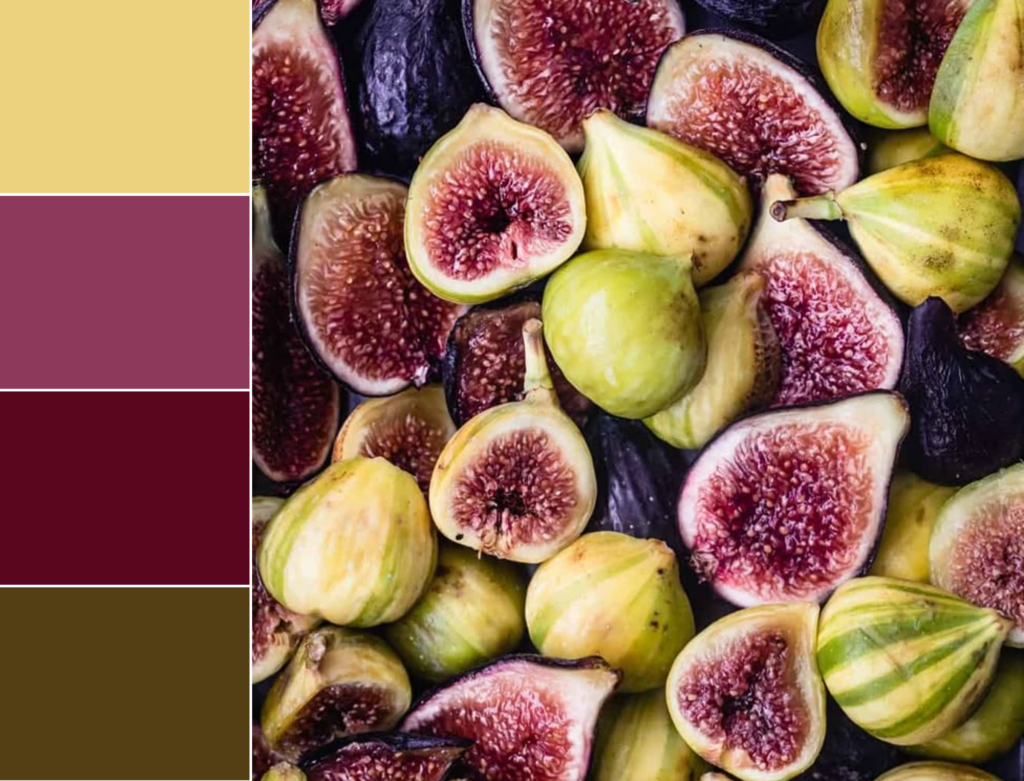
There is something deeply Autumnal about a ripe fig. The dusty green skin. The rich burgundy flesh. The muted purple-brown stem. It feels earthy, abundant and grounded.
But then I did what I always do: I stopped looking at the fruit and started looking at the colours. What is interesting is that this palette is not simply cool or warm. It is a conversation between the two
The golden yellow and olive-brown bring warmth and that connection to nature, while the wine and berry tones introduce depth with a cooler undertone.
Our brains read this combination as Autumn
— not because every colour is warm, but because the overall impression is rich, layered and organic.
Perhaps that shouldn’t have surprised me. Figs are, after all, a summer fruit, usually ripening in late summer just as the seasons begin to overlap.
Maybe that’s why they feel like such a natural bridge between Summer and Autumn. They carry the richness we associate with one season, while quietly wearing the colours of the other.
Let’s say you already have a warmer burgundy piece in your wardrobe. Instead of pairing it with the usual Autumn companions — caramel, chocolate brown or warm olive — try introducing a cooler green. Sage, eucalyptus or a muted olive can create a bridge between the two seasons. The green brings the freshness of Summer, while the burgundy keeps that grounded, Autumnal feeling.
The same works in reverse. If you own a warmer, muted green — think khaki, or olive — pairing it with a cooler earthy tone such as plum or a soft burgundy can shift the whole look. The cool red adds depth without making the outfit feel overly warm.
And this is why these combinations feel so natural. They may not sit neatly together on a seasonal colour chart, but nature has never followed those rules.
Green leaves with purple veins. Figs with dusty green skin and deep plum flesh. The world around us has been combining these colours all along.