A visual guide to understanding Summer colour analysis beyond colour swatches
We are taught that Summer is cool, soft and light. But those words are surprisingly abstract.
Cool compared to what?
Soft in what way?
How light?
They describe colour, but they do not paint a picture.
The words themselves are not wrong. They are simply incomplete. Cool, soft and light describe the technical qualities of Summer colours, but they do not explain why certain shades feel like they belong together. They do not explain why a cloudy sky, a weathered stone building or a quiet garden after rain can all evoke the same feeling as a muted blue-grey or a dusty rose.
I wanted to try something different.
Instead of defining Summer through technical colour theory, I wanted to translate it into places, weather, textures, architecture, materials and moments that feel unmistakably Summer.
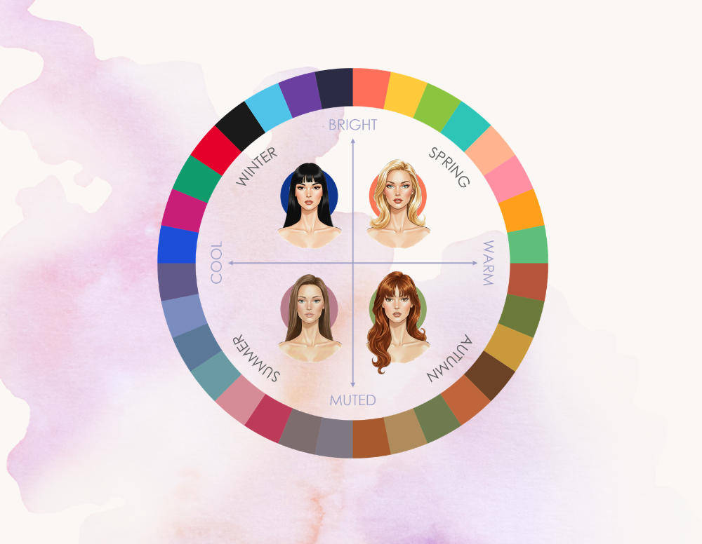
To understand what makes Summer unique, it helps to look beyond Summer itself. The words cool, soft and light are not exclusive to one season; they appear throughout seasonal colour analysis, but they take on a different character depending on the palette they belong to.
A Winter blue and a Summer blue are both cool, but they do not create the same feeling. A Spring colour and a Summer colour can both be light, but their lightness comes from different places.
The difference is not just in the colour itself — it is in the atmosphere it creates.
Seasonal Dialects
Perhaps the easiest comparison to make is between Summer and Winter, because both seasons share a coolness — but the feeling behind it is completely different.
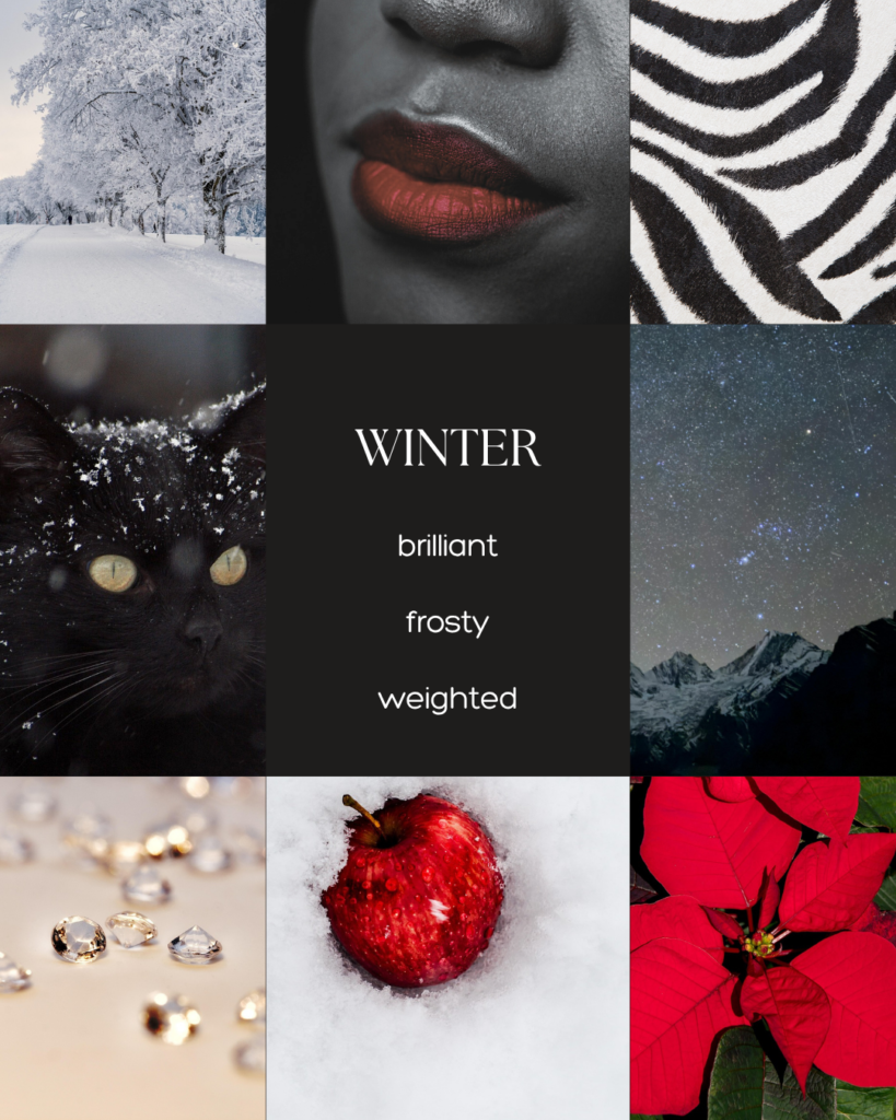
Winter is cool like fresh snow, frozen ice, and cold air. It is a coolness that comes from stillness; sharp, crystalline and untouched.
Summer, on the other hand, is cool like a breeze through an open window, a shaded garden or July rain. It is a coolness that never sits still, always shifting and passing through.
Both seasons belong to the cooler side of the spectrum, but —
Winter freezes while Summer flows.
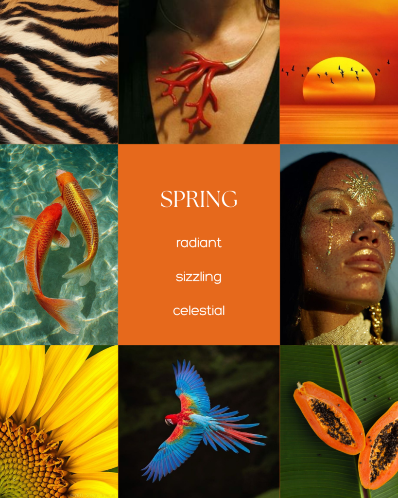
Spring and Summer are often confused because both are light seasons, but their light tells a different story.
Spring’s light is the bright, golden light of a clear day at noon — direct and full of energy. The world feels alive as flowers bloom and nature bursts into colour.
Summer’s light is softer and more elusive. It is the sunbeams softened by passing clouds or the gentle fading of the day as the sun begins to set.
Spring’s light is warm and glaring.
Summer’s light is hazy and elusive.
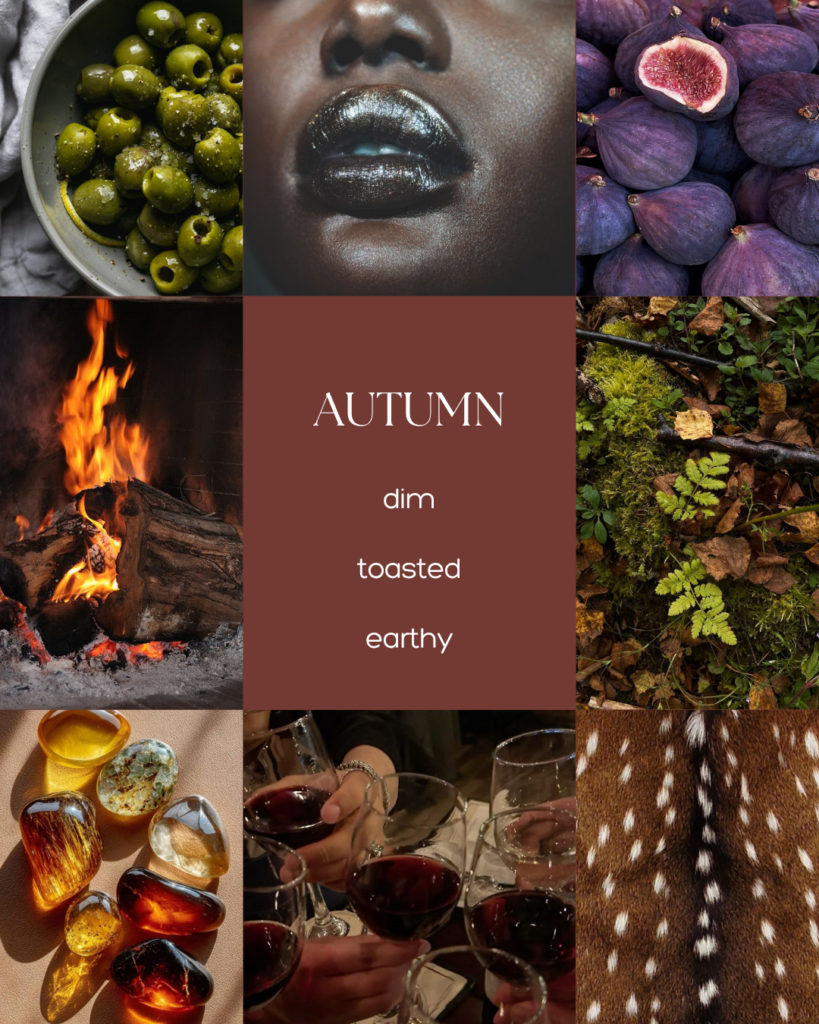
Autumn and Summer share a softness, but they express it in opposite ways.
Autumn is soft like the soil beneath fallen leaves, like moss-covered forests, worn leather and warm wool. Its softness is grounded, textured and directly connected to the earth.
Summer is soft in a more weightless way — like mist, feathers, faded linen or a cloud passing across the sky.
Where Autumn gathers and settles, Summer drifts and fades.
A Place Called Summer
Perhaps the biggest challenge in understanding Summer is the fact that the season itself seems to contradict the palette. In everyday life, Summer is associated with warmth. It is the season of golden sunlight, hot days, sun-kissed landscapes and colours that feel bright and alive. But in seasonal colour analysis, Summer is the cool season — a palette defined by softness, subtlety and colours softened by haze.
The Summer of nature and the Summer of colour theory are not quite the same thing.
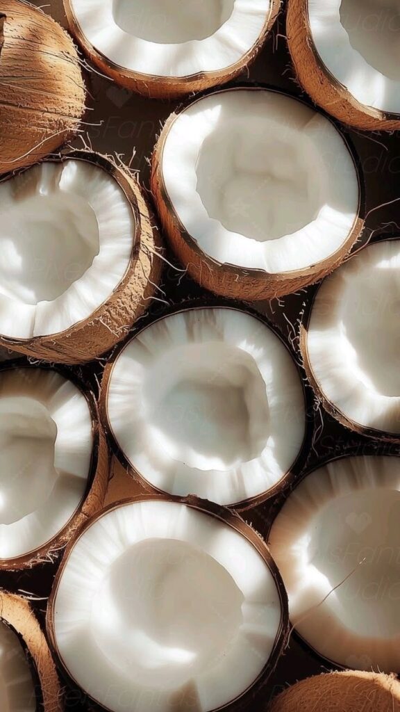
This is where finding the visual essence of Summer becomes more complicated. When we imagine summer, we often picture tropical beaches, turquoise waters, golden sand, palm trees, mangoes, pineapples and hibiscus flowers. These images capture the feeling of a hot summer holiday, but from a colour perspective they belong to a world of warmth, clarity and intensity. They are closer to the clarity and intensity. They are closer to the energy of Spring
— warm, bright and vibrant.

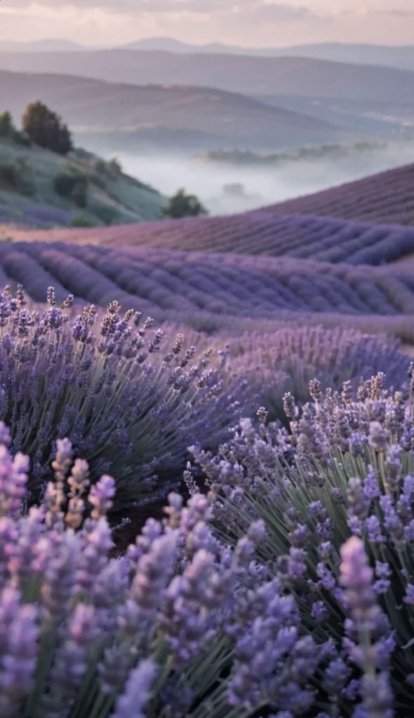
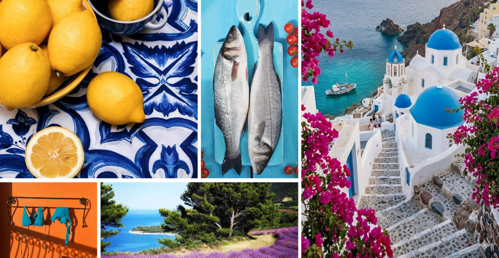
For a while, I thought the answer was the Mediterranean. White stone, clear water, lavender fields, lemon trees, blue window shutters and evergreen pines all seemed much closer to the feeling I was searching for. There is a coolness here that tropical summer lacks — the shade of old stone buildings, the calm blue of the sea, the muted greens of coastal landscapes.
Yet, something still did not quite fit.
Mediterranean summers are still defined by intense sunlight. The colours remain clear and luminous, the contrast between white walls and blue skies is striking, and the landscape still carries a certain brightness. It feels like a cooler interpretation of summer, perhaps closer to a Winter
— serene and refined, but still too intense.
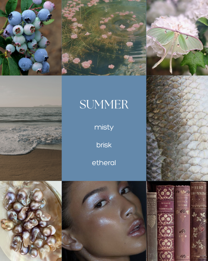
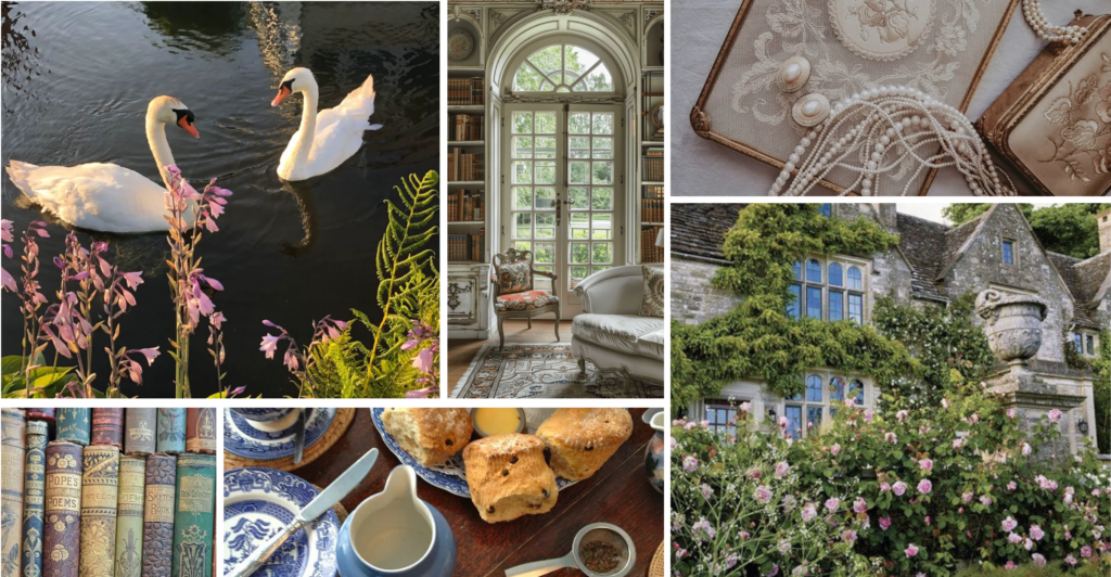
And then, somewhat unexpectedly, I arrived at the conclusion that the Summer palette might be best represented by… an English summer. Yes, the irony is not lost on me. Most people don’t associate summer with grey stone buildings, cloudy afternoons and the occasional need for a cardigan. Yet, when looking at Summer through the lens of seasonal colour analysis, this slightly moody version of summer starts to make perfect sense.
Imagine an old English manor on a summer afternoon.
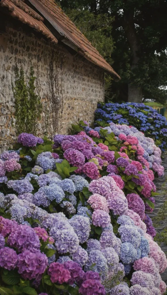
The stone walls have been weathered by time, softened into shades of cool grey and muted beige. Around the house, a garden blooms
quietly: hydrangeas in dusty blues and soft pinks, greenery softened by overcast skies. In the centre of the garden sits a murky water lily pond, reflecting the shifting colours above.
Inside, the manor is calm and timeless. A library is filled with antique books collected over generations, their pages faded with age. There is a light layer of dust on the shelves, not from neglect, but from history. Linen curtains move gently in the breeze coming through an open window.
The entire scene feels quiet, layered and slightly faded — not bright, not dramatic.
This, to me, is where Summer lives.
What makes this version of summer so fitting is that it captures the three qualities that define the palette. The light is present, but diffused — filtered through clouds, mist and curtains rather than shining directly overhead. The colours are cool, but not cold — found in rain-washed stone and shaded gardens rather than ice and snow.
And the softness comes from the way these qualities meet: the combination of dimmed light and gentle coolness creates an atmosphere that feels airy, breezy and almost ethereal.
Summer is a palette of quiet relationships — colours that blend and flow together.
The Summer Cabinet of Curiosities
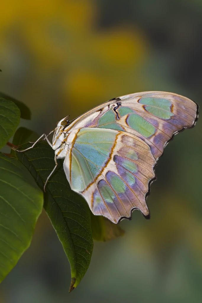
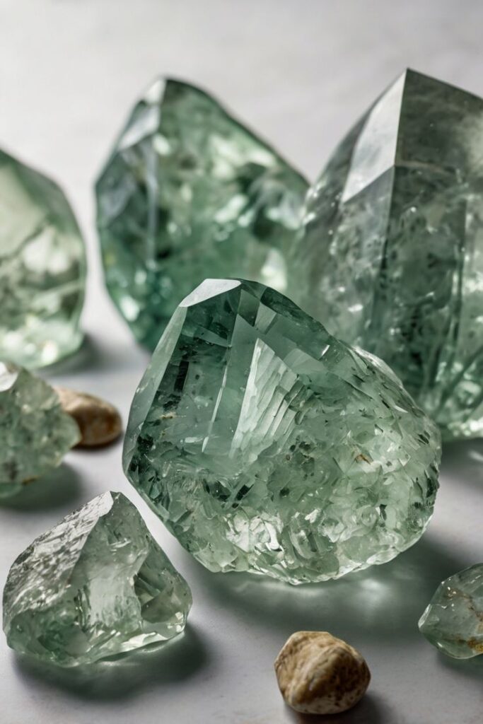
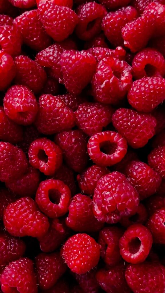
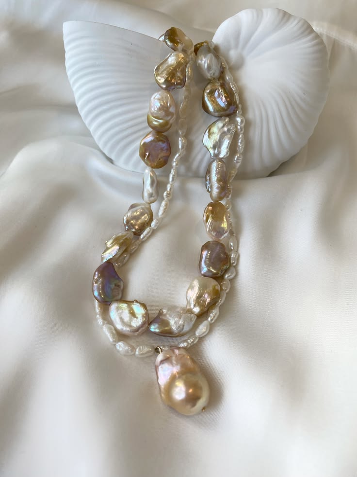
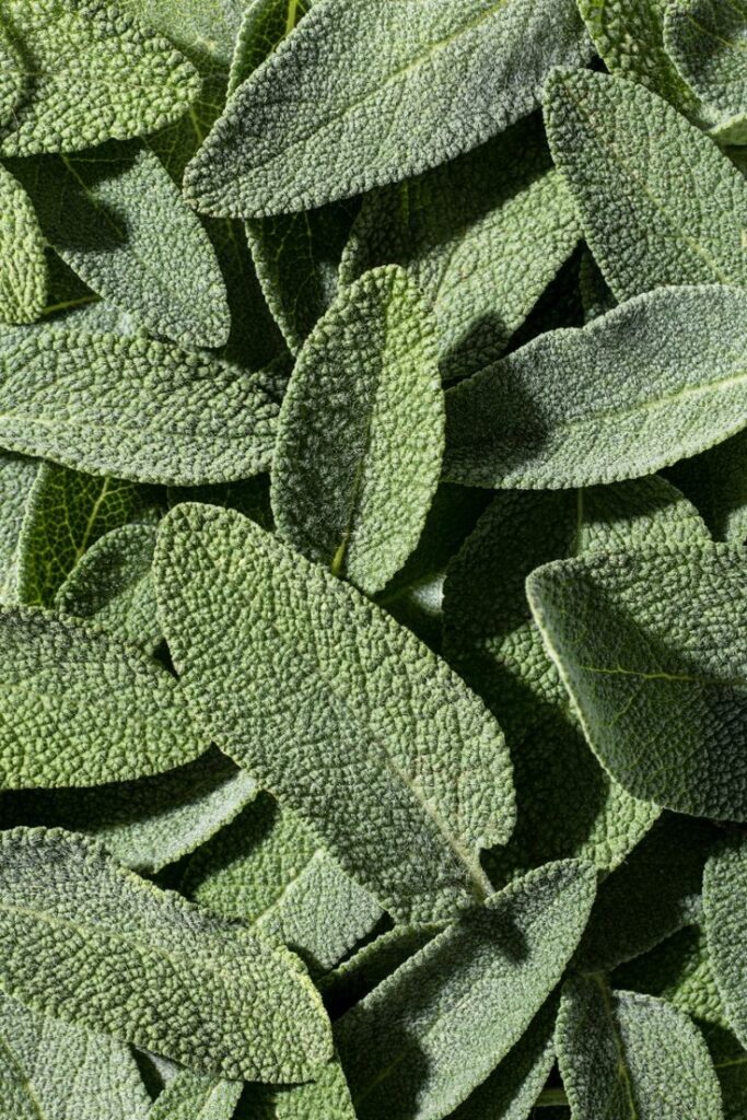
The beauty of an atmosphere is that it is built from many smaller impressions. Once we understand the overall feeling of Summer, we can begin to look at the individual elements that contribute to it. The colours found in nature, the materials that surround us, the textures we associate with it and the objects that carry the same visual language all become pieces of the same story.
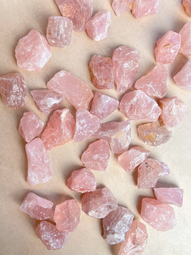
This is where our little collection of Summer keepsakes begins — a gathering of objects, textures and impressions that capture the essence of the season.
Each one is a small fragment of the same atmosphere, carrying the qualities we have been searching for: coolness, lightness and that airy, almost ethereal softness that defines Summer.