Animal print is back
Again.
At this point, I’m starting to think leopard print has achieved some sort of fashion immortality. You can bury it under ten years of quiet luxury, minimalist tailoring and beige everything, and somehow it crawls back out looking completely unbothered.
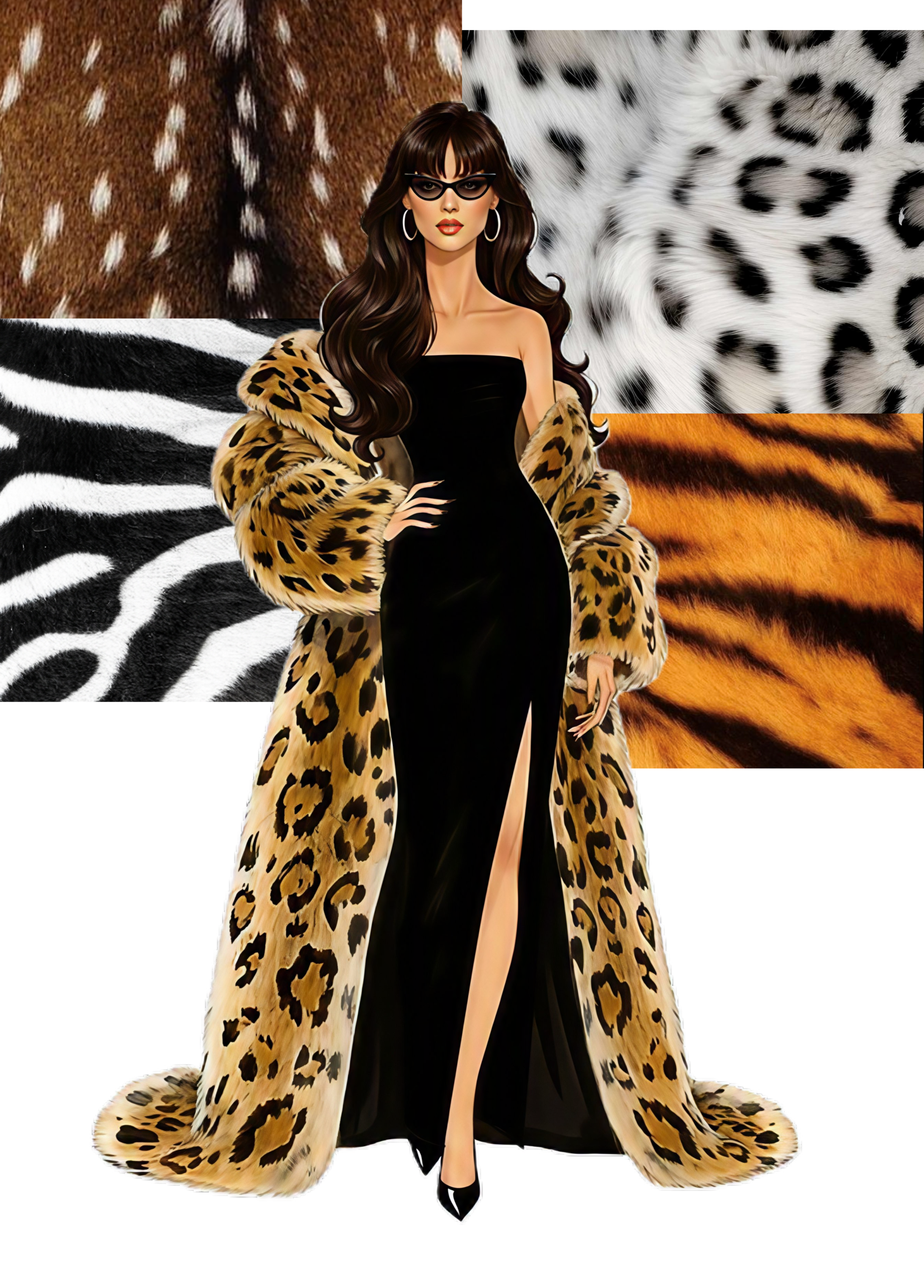
And it isn’t just leopard. Zebra, tiger, snakeskin, deer — the whole zoo seems to have made its way onto the fashion calendar.
And honestly, I get it. Animal print is cool. It is bold and confident. It can make an otherwise very normal outfit feel instantly more interesting.
Nothing Personal
I must admit that my relationship with animal print is somewhat complicated. Up until recently I wasn’t particularly drawn to them. I think personal taste definitely played a part, but fashion influences probably did too.
Wearing animal print can look incredibly chic, but it may also become very cheap very quickly, and I wasn’t entirely convinced I knew how to make it work.
So clearly, my anti-animal-print stance had some holes in it.
Then, a few years ago, I bought a faux-leather skirt in a gorgeous black-and-brown snake print. At the time, I thought the print was very out there.
It was definitely outside my comfort zone, but I knew I really liked it aesthetically, so I went for it anyway. It is now one of my favourite pieces in my wardrobe.
Fast forward a couple of years and I found myself seriously considering animal print again: the leopard-print Adidas Originals Sambas. I deliberated over those shoes for months.
They were absolutely cool. But I couldn’t work out whether I actually wanted them or whether I just wanted them because I was seeing them everywhere.
Would I still wear them once the trend had moved on? More importantly, could I actually see myself styling them in a way that felt like me?
Eventually, the answer was no.
And, admittedly, I am petty enough that if everyone else has something, I don’t want it anymore.
So I didn’t buy them.
Honestly, I think that was the right decision. I still think those shoes are super cool. They’re just not for me. And that’s okay.
The Anti-Summer Safari
The problem isn’t necessarily that I don’t like animal print. In fact, I clearly do — I own a snake-print skirt that I love.
The problem is that most of the animal prints we get in fashion are not exactly screaming Summer.
Think about the animals we tend to borrow from: leopard, zebra, tiger, deer. Their natural patterns are often warm, bright, dark, or incredibly high contrast. Leopard comes with all those golden browns and creams. Zebra is basically black and white. Tiger is orange and black. Even when the colours aren’t particularly warm, the contrast can be intense.
Which is pretty much everything a Summer isn’t.
And yet animal print is back again for FW26, so I’m not going to sit here and pretend I don’t want to play with it.
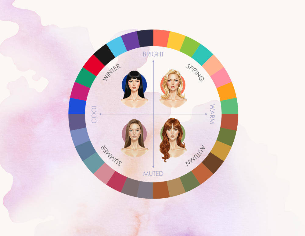
Seasonal colour analysis is very good at explaining why certain versions of a colour work better than others. But prints are a little more complicated. You’re not dealing with one colour anymore. You’re dealing with several colours, their proportions, the contrast between them, the scale of the pattern and the overall impression they create.
Because why are we always borrowing prints from animals with warm brown fur?
Where is the butterfly print?
Give me mauve, grey and a little cool green in an oversized, slightly abstract butterfly pattern and I will be sold immediately.
Nature has plenty of Summer colours. Fashion just seems weirdly committed to giving us leopard.
So we make it work.
Wild & Wearable
And FW26 is giving us plenty to work with. Animal print has shown up across the runways in all sorts of forms, and the trend is already making its way into the new autumn collections. Some of it is very traditional, some of it is considerably more creative, and some of it is… well, questionable.
Which makes this much more interesting than simply asking whether Summers can wear leopard.
I want to look at what is actually out there this season and figure out three things: how to make the traditional animal prints work for a Summer, which prints naturally harmonise with the Summer palette, and which ones I would probably leave alone.
Accessories first.
The easiest way to experiment with a traditionally warm or high-contrast animal print is to keep it away from your face. A journal, phone pouch or little bag charm gives you the pattern without asking your colouring to do all the work. I am specifically drooling over the pony hair leather journals from Indigo Lush — it’s a slightly unexpected way of bringing animal print into your everyday life without turning your outfit into Animal Planet.
Then bags.
This is probably my favourite way to wear a traditional animal print. Smaller structured bags, clutches and pochettes feel very chic and much more intentional than a huge printed tote. I honestly wish I had the budget for a vintage Fendi, because these styles are exactly how I would wear the trend — a print that is part of the character of the bag rather than the entire outfit. And if you want to push it a little further, I love the idea of an animal print paired with a genuinely bold colour. A cool red, cobalt, pink or purple can make the whole thing feel much more deliberate — and much less like you’re trying to recreate a 2010s leopard-print outfit.
And apparently, nails.
I kept seeing animal-print nails on Pinterest and honestly… I love love love it. This might be the ultimate solution for anyone who loves the look but doesn’t actually want to own an animal-print garment. Zebra tips, tiny tortoiseshell details, leopard spots — it’s basically jewellery for your hands.
Shoes are where I’d get picky.
Animal-print shoes come in all shapes and sizes this season, but personally I’d go for something sleek and relatively small: a pointed or square-toe heel or mule in zebra or snakeskin, worn with long boot-cut or wide-leg trousers so that you only get a little glimpse of the print as you walk. It’s subtle, slightly unexpected and, to me, much more timeless than making the entire shoe the statement.
What I wouldn’t rush out to buy? Full-print trainers and boots. I can absolutely see myself getting bored of those much faster. They’re fun, but they’re also very tied to the particular trend moment we’re in right now.
And if you want to take it beyond accessories, this is where I think the amount of print — and where you put it — starts to matter a lot more.
Skirts are probably the easiest place to start.
I think you can wear pretty much any animal print on a skirt and balance it out with the rest of the outfit. It’s far enough away from your face that you have much more freedom to experiment, and personally, this is where I would have the most fun with it.
My favourites are definitely midi-length leather skirts, especially zebra and snake. There’s something about an animal-print leather skirt that feels effortlessly cool. Pair it with a simple knit, a fitted top or even a chunky jumper and let the skirt do the work.
Tops are where I’d get much more cautious.
Your top is the closest part of the outfit to your face, so this is where I would want to anchor the colour harmony. For that reason, I’d probably stay away from the really traditional warm prints — leopard, cheetah, fawn and anything else that’s basically made up of warm browns, tans and golden beige.
But zebra gets interesting again.
I’ve seen some really pretty zebra-print ruffle shirts that aren’t the usual harsh black-and-white version. Softer brown and white, less defined lines, a slightly blurred effect — basically a zebra print that looks like it has been turned down a few notches. That I could absolutely see working for a Summer.
Dresses are a little easier.
If I wanted to wear one of the really warm traditional animal prints, I’d look for a dress where the print isn’t right up against my face. Something multi-coloured or multi-textured gives you more to work with.
For example, I love the idea of a dress combining leopard print with lace or florals. There’s something very Cavalli-esque about it. It’s also quite sensual, which I think is an interesting way to bring some of that traditionally Autumnal animal-print mood into a Summer wardrobe.
And then there are the prints that just completely ignore the natural colour palette. I came across a blue-and-brown zebra-print dress from Mango and thought it was so interesting. It’s still obviously zebra, but the colour combination makes it feel like something completely different. This is exactly the kind of trend reinterpretation I love because you’re not trying to convince yourself that warm beige is suddenly cool-toned. You’re just changing the colours.
And finally, outerwear.
This is where I’d first have to ask myself whether I actually want to invest serious money in an animal-print piece that is very much part of a trend. A coat is a pretty big commitment when you’re not sure how you’ll feel about the print in three years.
But let’s pretend we’re in a fantasy world where a budget doesn’t exist.
My first choice would be a soft, slouchy wool or cashmere coat in a slightly muted leopard print. And ideally, it would have a deep grey collar.
The grey would sit right around the face and bring in that cooler element, while the leopard could still be warm and slightly wild. I think that contrast could actually make the whole thing feel much more intentional.
And second on my completely hypothetical wish list would be a deep brown fawn-print short jacket with faux-fur sleeves and collar.
Do I have a colour-analysis explanation for why I think this would work?
Not really.
Would it actually work?
Maybe not.
But in my head, it looks so good.