I was now officially a believer in seasonal colour theory. But I still wasn’t ready to invest in professional colour analysis—partly due to finances, but mostly because I wanted to experiment on my own.
I didn’t have a method yet, just a growing suspicion that certain colours and tones were behaving differently on me. So I started paying closer attention in the most practical way possible: by looking at what was already in my closet.
The Shoe that Fits
My first light bulb moment came when I went shopping for a pair of heels. I’d been trying to find a pair of nude heels I actually liked for what felt like forever. Every time, it was the same story.
Every nude heel looked beautiful on the shelf — and terrible on me.
The shoes would turn muddy, and my skin would turn purple.
Why did this keep happening?
I was convinced there was something wrong with my complexion
—that I was simply too pale to wear certain colours, or maybe any colour at all.
One day, I got particularly desperate. I really needed a pair of nude heels to go with a dress I’d picked out for dinner. I wasn’t optimistic I’d find anything at such short notice, but I had some time to kill, so I wandered onto the high street.
I walked into M&S and spotted something I didn’t remember ever seeing before: a pair of cool-toned, rosy nude pumps. That was different, so I tried them on. To my surprise, they looked great on me. My skin didn’t look purple or corpse-like. They just… worked.
Different hues of Nude
Warm Nude
My skin: purple, unalive. The shoe: muddy.
Rosy Nude
My skin: bright, glowy. The shoe: blended in.
There was nothing wrong with my complexion, I was just wearing the wrong undertone!
That was my first clue as to why warm nude shoes had always looked so terrible on me.
Maybe I was cool-toned?
The Silver Medal
My second piece of evidence came from something deceptively simple
—jewellery.
I had always gravitated towards gold without really questioning it—it just felt like the default.
But after the shoe moment, I started paying closer attention.
I prepared the scene: I tied my hair back, went in with no makeup, and wore a strapless top to minimise interference. I started draping gold-toned necklaces and earrings on myself first, then silver.
I kept staring at my reflection, expecting something to click, but I couldn’t really see anything clearly. Neither looked obviously wrong, but it didn’t look obviously right either
—it just sort of sat there.
So I changed approach. I took photos. One fully in gold jewellery, and one fully in silver, so I could come back to them later with fresh eyes, when I wasn’t so in-the-moment.
I let weeks go by. I didn’t think of it much. When I revisited the photos, it finally clicked.
In the gold version, my face looked completely flat. The most prominent feature wasn’t my eyes or my skin—it was my purple under-eyes. Everything felt slightly muted; I didn’t look discoloured, but somehow invisible, like I had blurred into the background and it was difficult to see me clearly in the image.
In the silver version, none of that happened. My face looked clearer, more defined—almost sharper, in a way I can’t fully explain. It didn’t “add” anything; it just brought my features into focus.
Choose your Sparkle
Gold
Flat and out of focus — my under-eyes did the talking
Silver
Sharp, clear — my actual features showed up
Same jewellery drawer. Completely different face.
I could clearly see my jawline, my cheekbones, and my facial structure overall.
Funnily, I think I had my @carolbrailey moment then, even though I didn’t know what to look for, somehow I managed to find it.
Another piece of the puzzle fell into place…
Mustering the Undertone
Looking back, those M&S shoes were all the proof I needed that I was cool-toned. However, as a scientist, I was trained that you cannot draw conclusions from an experiment that hasn’t been performed a minimum of 3 times.
As if all those beige tops I bought during my delulu Autumn era weren’t enough, my 3/3 came while I was scrolling through my phone’s photo library, trying to free up some space.
I came across a photo a friend had taken of me while we were out for lunch, wearing my (very beloved) mustard yellow jumper. It was cute and comfortable, with a boat neckline and wide, almost batwing sleeves.
I had loved wearing it for a long time.
But something had changed.
On second glance, all I could see was how washed out I looked. I’m extremely pale to begin with, but in that photo I look literally grey
— like I had stepped out of a black-and-white film while everything around me was still in colour.
Could it be that my favourite mustard jumper simply wasn’t doing me any favours?
I refused to jump to conclusions and kept clearing out my gallery. Then it hit me like a brick: another photo, a different day, the exact same jumper. And you can probably guess the rest — my face looked just as colour-drained.
It was a beautiful sunny day over the Easter break, my friends and I were outside barbecuing and having fun, yet when I think back to that day now, all I can remember is one thing:
—damn, I look terrible in mustard.
Mustard
Warm + Muted
COLOUR NOTES
Turns out mustard and I were never actually compatible.
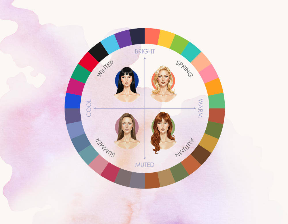
Its warm, muted nature belongs to the Autumn palette. Against cool, muted Summer skin, it doesn’t blend, it fights. Instead of warming the face, it pulls the colour out of it — leaving skin looking washed out, grey, drained.
With a heavy heart, I finally admitted to myself—
I need to retire that jumper.