The Best Animal Prints for Every Colour Season
Colour is not the only thing that creates a seasonal impression.
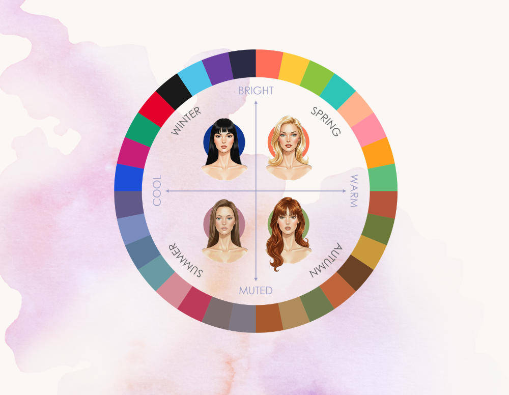
The shapes, contrast, and movement within a pattern can influence how we perceive it too. If seasonal colour theory is really about the relationship between these elements, then the same principles should apply beyond solid colours — and animal prints are the perfect case study.
So let’s put the theory into practice and look at some prints through a seasonal colour analysis lens.
The goal isn’t to create a strict list of “Winter prints” or “Summer prints”
—almost any print can be recoloured to work for different seasons. Instead, let’s look at patterns and identify why certain classic versions naturally align with certain seasons.
WINTER
Winter is technically defined by three characteristics:
cool, bright, and deep.
But if I had to explain what makes Winter colouring immediately recognisable in practice, I probably wouldn’t start with those words.
I’d start with contrast.
Not because contrast belongs exclusively to Winter, but because it is often the most visually noticeable consequence of Winter colouring. Light and dark sit next to each other, and colours have a strong visual presence.
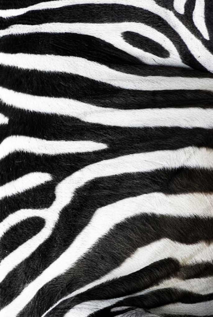
ZEBRA
If I had to pick one print that perfectly captures the essence of Winter, it would probably be zebra.
At first glance, it’s tempting to say it’s simply because it’s black and white. But I don’t actually think that’s the whole story. The structure of the pattern matters equally. The sharp stripes and clear boundaries between colours create a graphic, defined look that reflects the clarity and depth of Winter colouring.
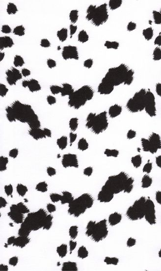
DALMATIAN
Perhaps no other animal print is as iconic as Dalmatian — just ask Cruella de Vil.
But what makes it work is not just the black and white colour combination. The spots look like drops of ink spilled on paper, creating a graphic pattern through the contrast between large blank space and bold marks. Rigid structure is not a prerequisite for boldness.
SPRING
Spring is defined as:
warm, bright, and light.
But if I had to describe the overall feeling of Spring colouring, the word that comes to mind is:
vibrant.
There is a particular energy to Spring colours. They are warm and lively, but unlike Autumn, they don’t feel heavy or grounded. And unlike Winter, they achieve brightness through lightness rather than intensity. The result is a palette that feels fresh and playful.
TIGER
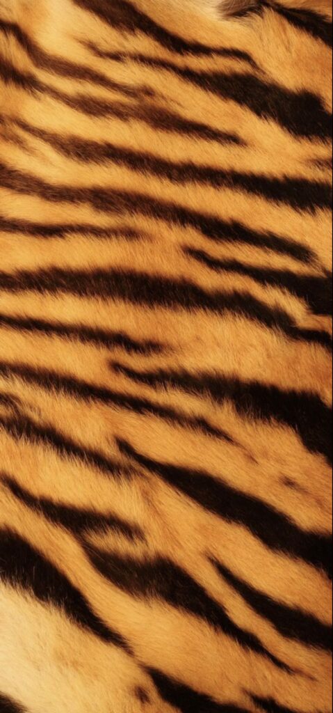
The Spring counterpart to Winter’s zebra has to be the tiger—the king of the jungle.
The warm bright orange and lifts the design, moving it away from the heaviness of a black-and-white combination. The vibrant background combined with defined black lines creates the brightness characteristic of Spring colouring. A print that carries its own sunshine.
COW
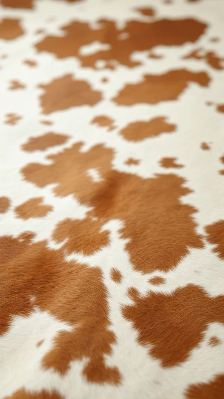
I can’t look at this print without imagining a green meadow scattered with yellow dandelions. Cows lazily grazing in the sunshine.
The cream creates an open, airy base, while the warm caramel patches add just enough warmth and definition without weighing the pattern down. Neither colour is particularly bold on its own, but together they create a print that feels fresh, luminous, and unmistakably Spring.
AUTUMN
Autumn is warm, deep, and muted.
But out of all the seasonal characteristics, the one I find the most visually obvious is
depth.
Autumn colours have a certain richness to them. They feel layered, complex, and grounded. And I think this is where the muted quality of the season can sometimes be misunderstood. Muted does not mean dull. When it comes to patterns, it is not about removing colour—it is about colours that feel more blended and less separated.
DEER
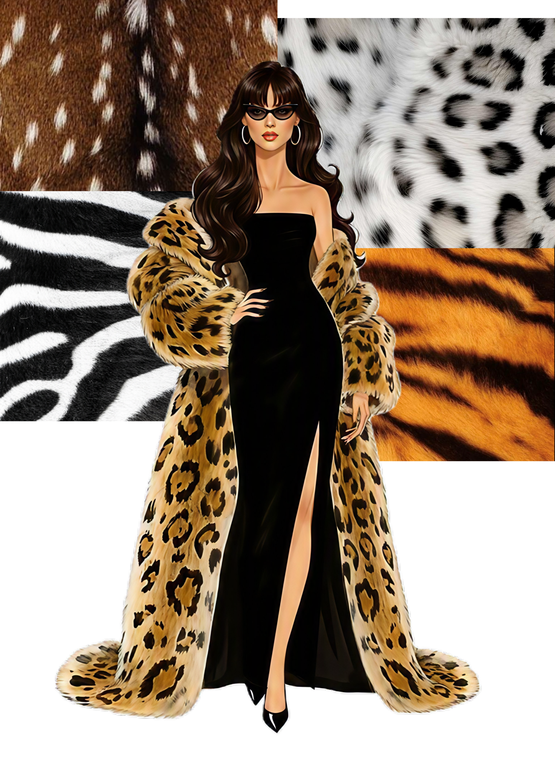
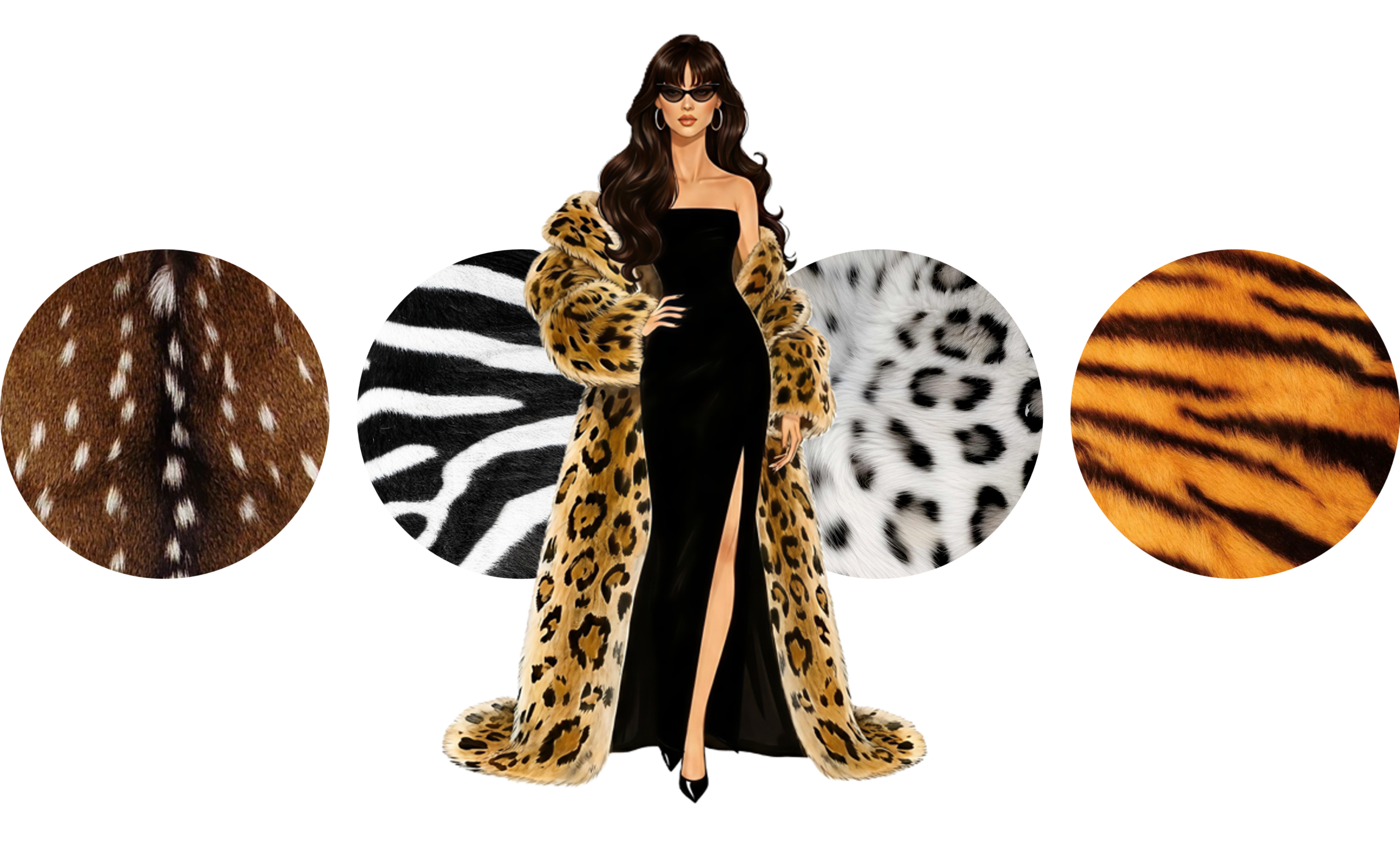
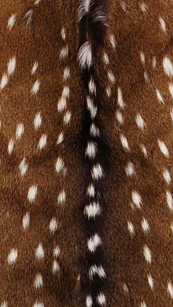
Deer print feels like Autumn in its most natural form—it simply belongs in a forest.
There is something about the combination of warm beige, caramel, and brown tones. The pattern doesn’t rely on strong contrast to stand out. The delicate spots softly break up the darker base without overpowering it, creating a pattern that feels grounded, warm and comforting.
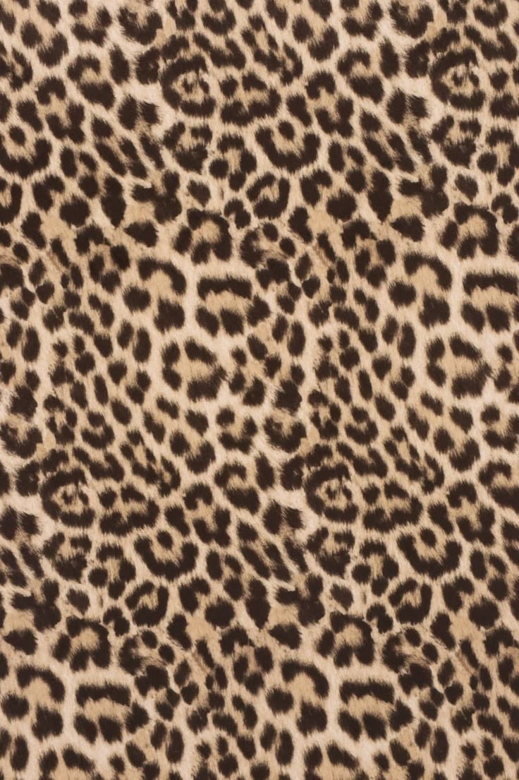
LEOPARD
At first glance, it is easy to reduce it to “it is brown, therefore it is Autumn”, but there is more to it.
The dark brown dots ground the pattern, but if you look closely, you will notice the edges are not perfectly sharp. They almost look like a watercolour painting, colours gradually bleeding into each other.
This combination of depth and softness gives off an extremely earthy, Autumn-coded vibe.
SUMMER
Last, but not least… Or should I say, best for last?
I’m teasing, obviously. There is no best season — all seasons are gorgeous once you figure them out. But you have to allow me this little joke; after all, it is my home season, and this is the Summer Palette Lab.
Summer is cool, light, and muted.
Out of all the seasons,
it is probably the one that feels the quietest.
Winter’s brightness catches your eye, its depth gives it presence. The brightness of Spring feels lively and energetic. Autumn’s warmth and depth make it feel rich. Summer, on the other hand, is discreet. It does not demand attention. Almost as if it exists under a veil, where colours gently merge together in a soft haze.
Perhaps that’s why it took me the longest to understand it.
SNAKE
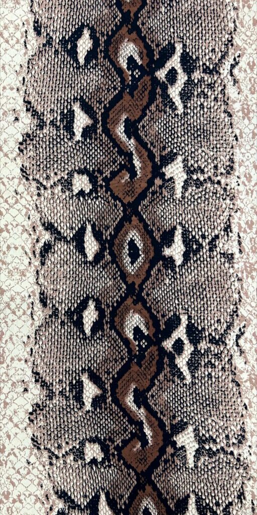
Admittedly, snakes come in many skins, so there is not really one single “classic” snake print to analyse.
However, I feel that snake is a quintessential Summer analogy. Snakes are cold-blooded animals, which already plays into the coolness of Summer colouring. The beauty of the pattern comes from scales creating a blurred, pixelated mosaic effect, perfectly channelling the Summer softness.
SNOW LEOPARD
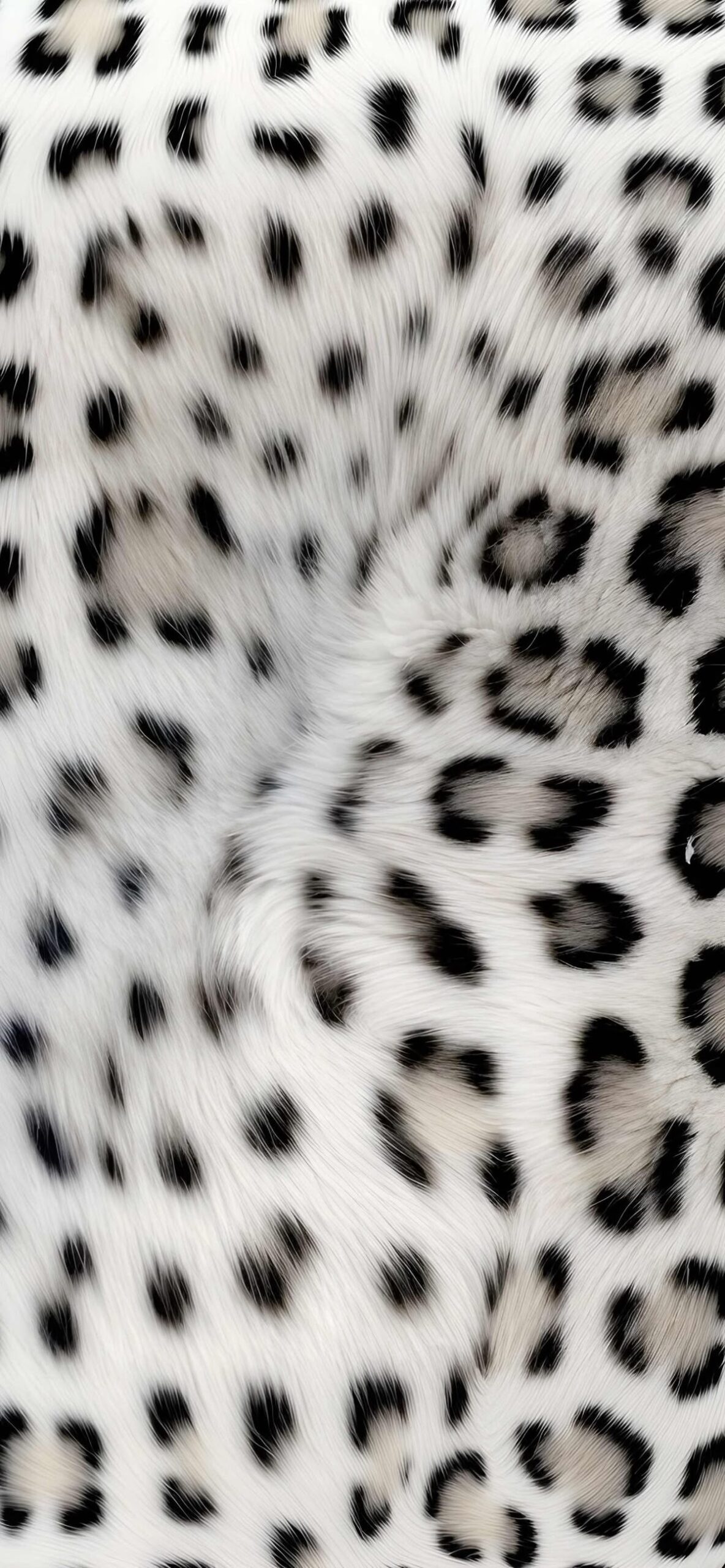
The snow leopard is the cooler (pun fully intended) cousin of the warm Autumn leopard.
The structure is identical. The difference lies in the colour. The warm browns have been replaced with dusty off-whites and cool greys, while the characteristic watercolour-like spots remain. The pattern feels lighter, cooler, and perfectly adapted to disappearing into snowy landscapes.
This little experiment reminded me of something I keep discovering throughout my colour journey: the theory is only the starting point.
The interesting part happens when you learn to observe the subtle differences—the shifts in contrast, the changes in mood, and the way individual elements come together to create harmony.
Colour analysis is not about memorising rules. It is about learning how to see.
But once you start noticing these details, suddenly a zebra is not just a zebra anymore…